GST6 is just out. It’s the best publication of its type and well worth a read. Link to PDF download here.
Category Archives: Mega-trends
The next 33 years on a single sheet of paper
A sneak peek at a talk I’m doing tonight about what’s on my new mega trends map (and what’s in my head, which is much the same thing). Plenty more of these talks to come including a few that are public.
Talking about the mega-trends map
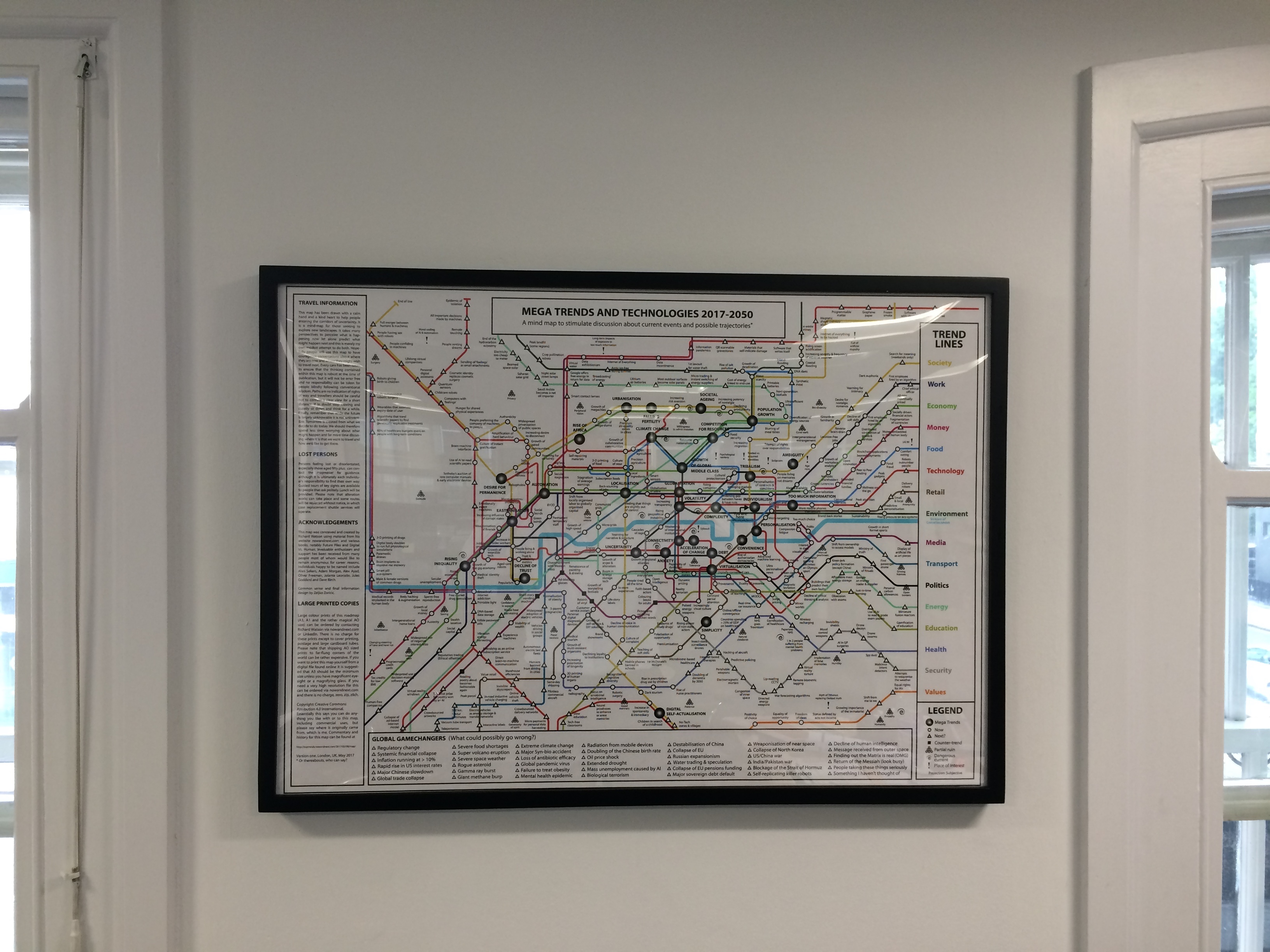
Framed
The Last Days of Cash
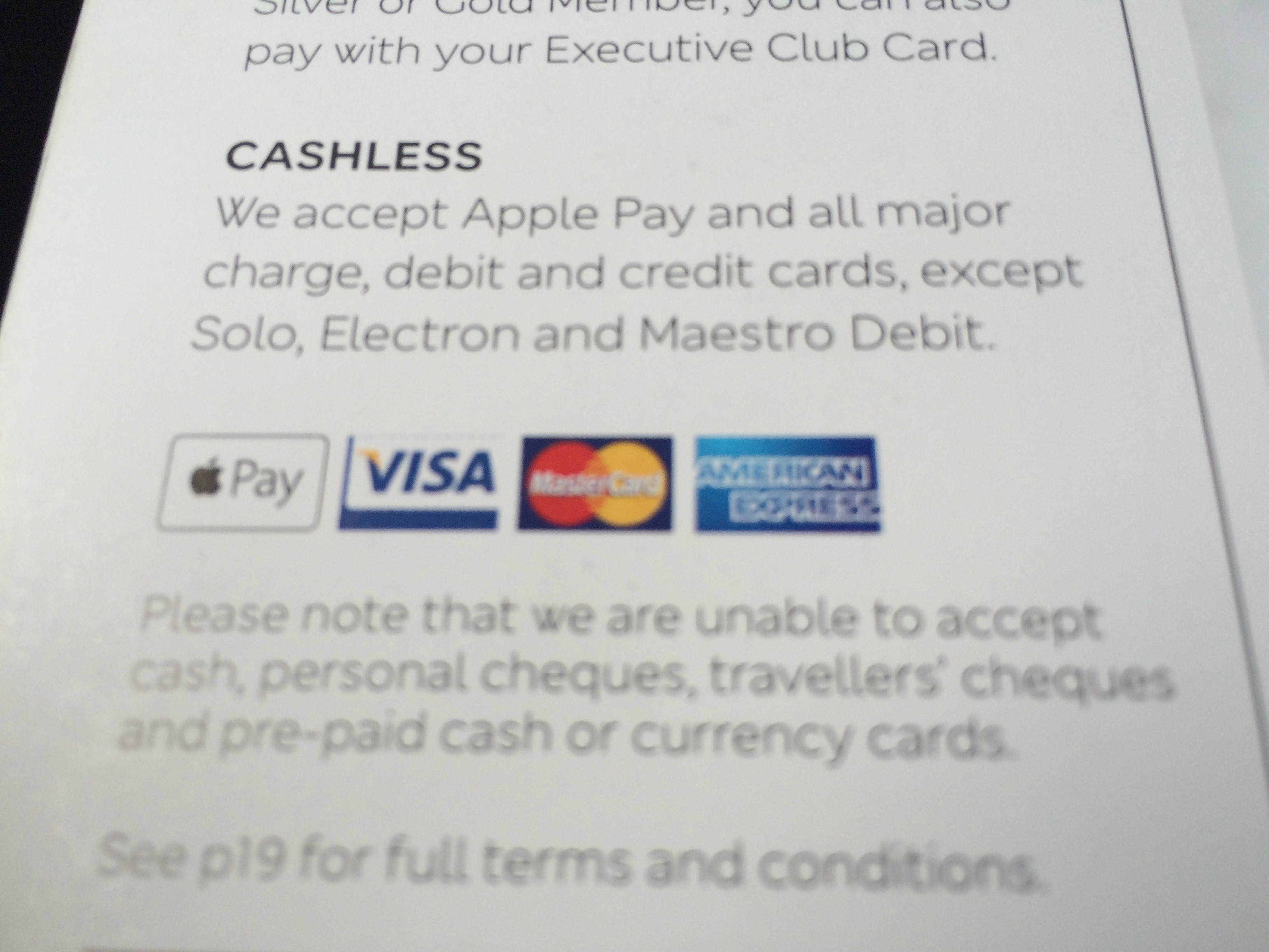
I was flying back from Germany yesterday and opened the BA snack menu only to find that they no longer accepted cash (is that even legal to do that?). Then this morning I was at Bill Granger’s cafe in Notting Hill and when I got out a £20 note to pay the reaction was “Oh…cash”. I guess my inclusion of cash as a partial ruin on my latest map isn’t that far off the truth after all.
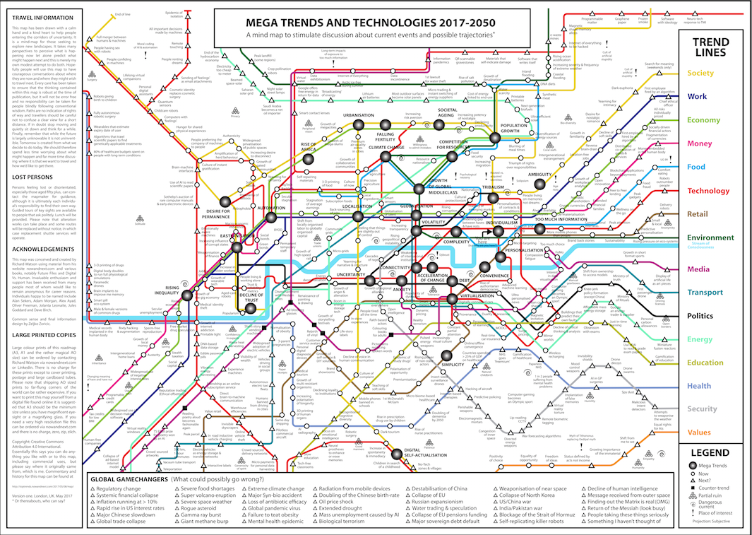
Map of Global Mega Trends
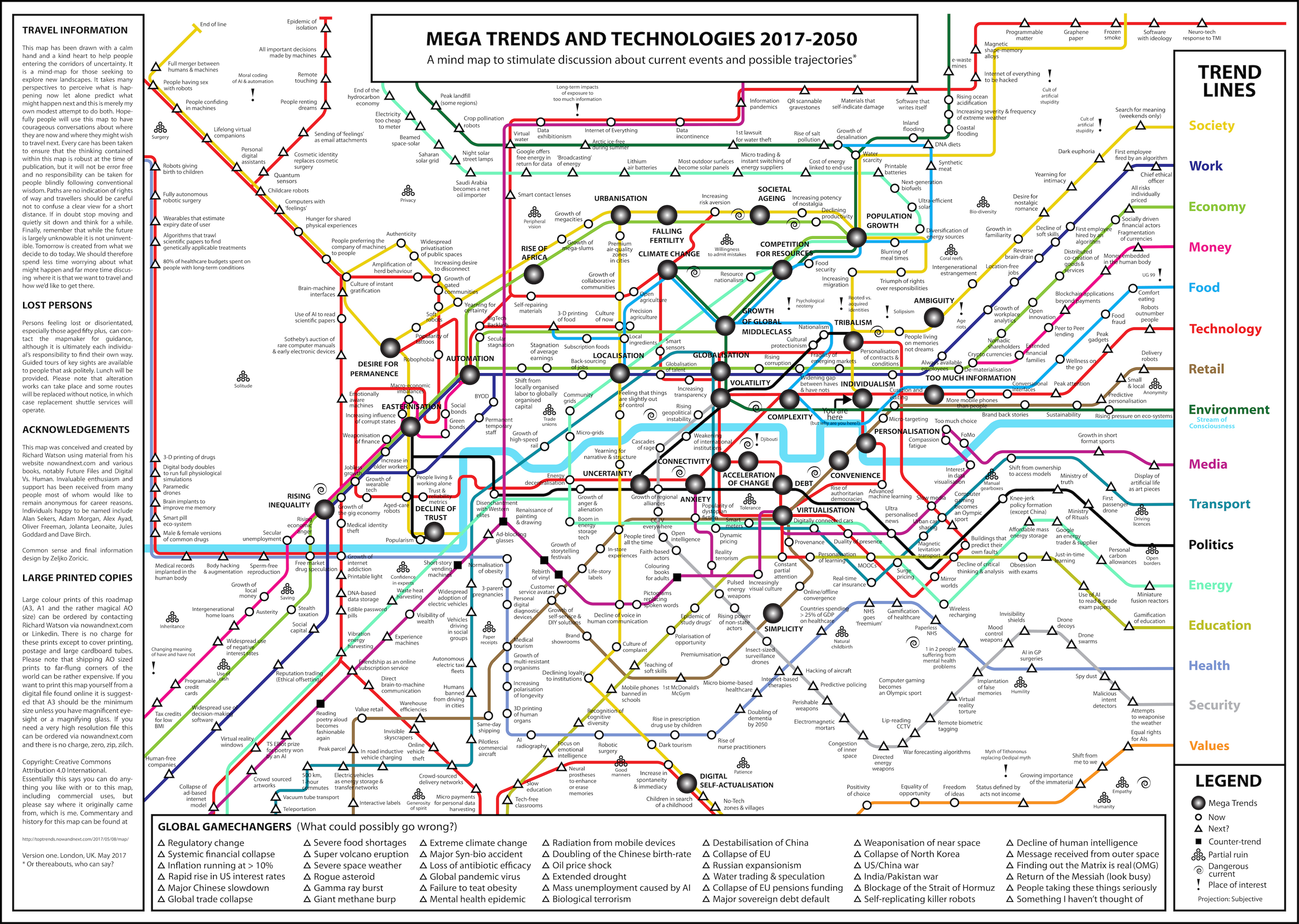
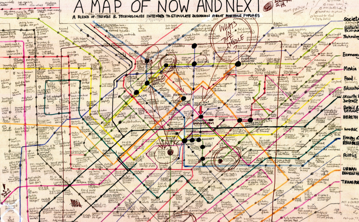
Here you go then. Use this link to get to a high resolution version. A3, A1 and rather wonderful AO sized copies on paper are available upon request (no charge except for print, post and a cardbaord tube). See you in the future.
New mega trends map
Map
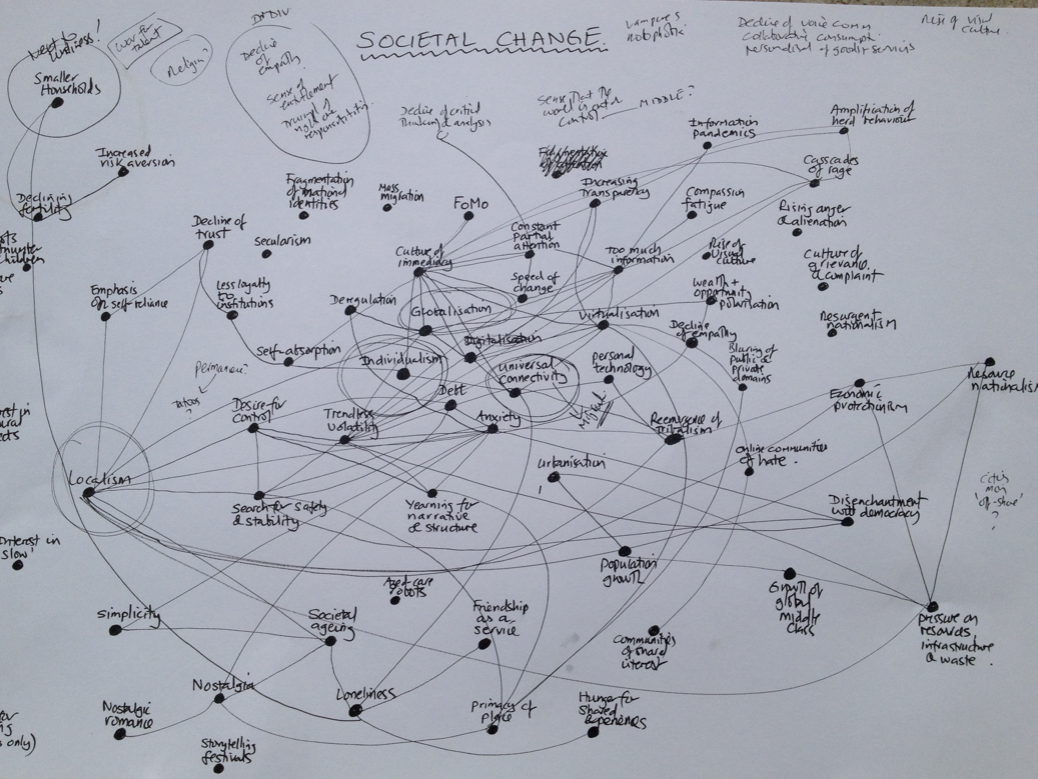
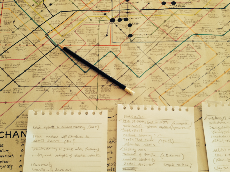
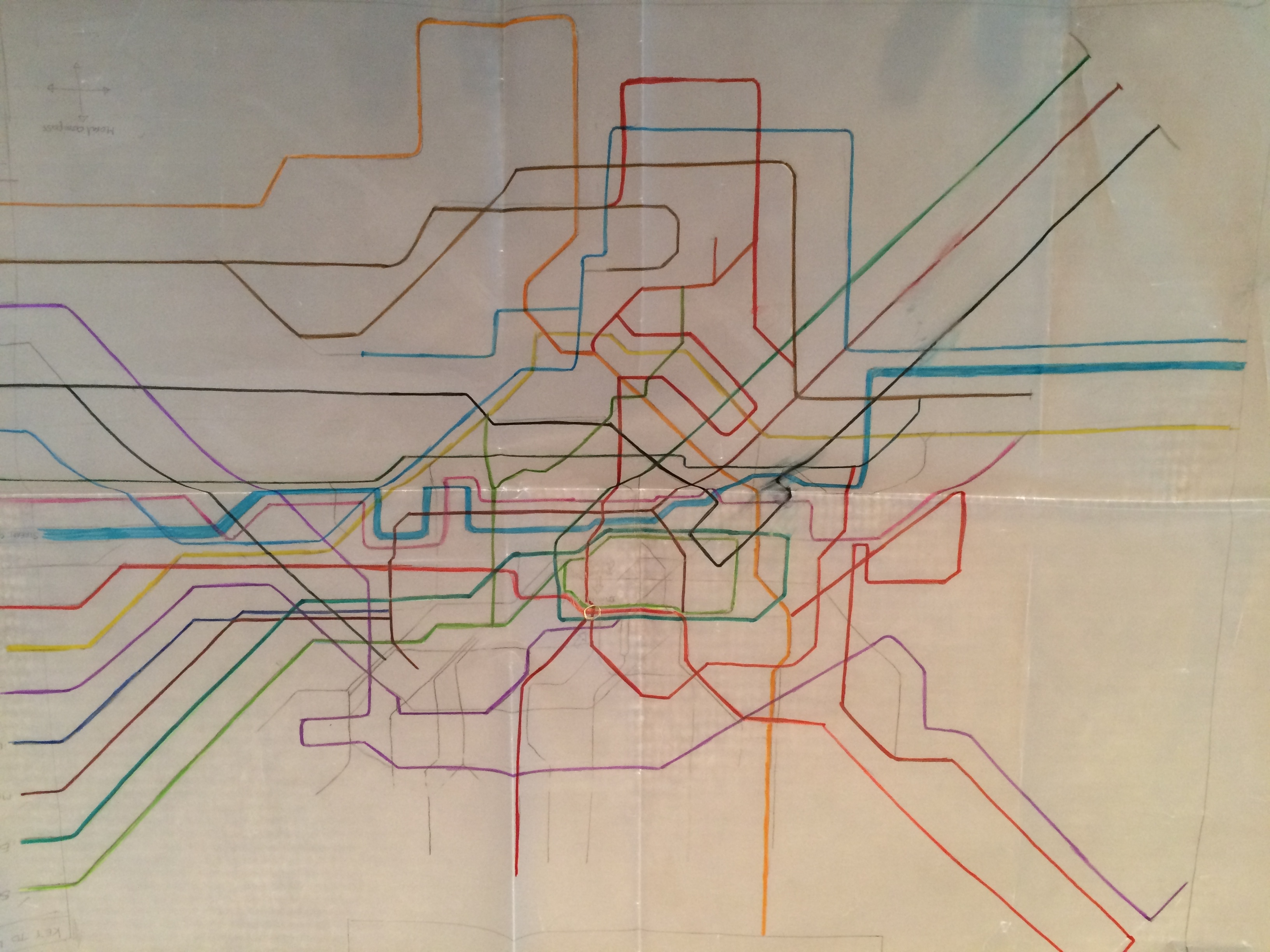
So here is a little background and commentary to my 2017 Mega Trends & Technologies map. This map began as an idea way back in 2015, but it wasn’t until early 2016 that I started to draw various outlines of what the map might look like.Eventually I settled on a look based on an earlier map I created in 2010. The initial thinking was very much about what the individual lines might represent and then obviously what to put on the lines and in particular the connection points (which took ages).
The mega trends were the first thing to get worked out. I had a gut feel about this already, but researched various publications to extend my thinking. These sources included work done by the MOD GST folks (Global Strategic Trends to 2040), the US National Intelligence Council (NIC) report on 2030, the OECD Science, Technology and Innovation Outlook 2016, Shell Scenarios and various reports by PWC, EY, KPMG and McKinsey. The main mega trends (about ten) broadly link with the mega trends contained within these reports, although I added a quite a few of my own to stir things up.
The final list of mega trends on the map (31 of them) are thus: population growth, urbanisation, rise of Africa, automation, globalisation, Easternisation, localisation (the same size as globalisation quite deliberately), climate change, falling fertility, societal ageing, competition for resources, growth of the global middle class, rising inequality, tribalism, ambiguity, individualism, volatility, complexity, personalisation, too much information, convenience, virtualisation, debt, connectivity, acceleration of change, uncertainty, desire for permanence, decline of trust, anxiety, simplicity, and digital self-actualisation.
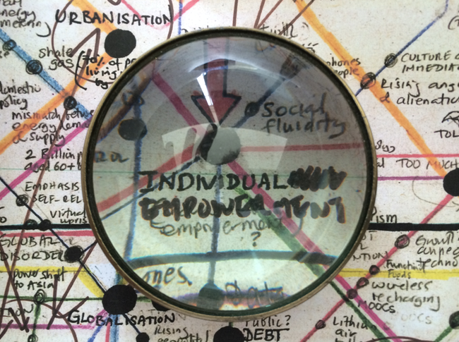
I had a big think about what should be in the middle of the map. In the end it was a connectivity, closely aligned with globalisation, acceleration of change, anxiety and volatility. Individualism was almost in the centre, but I had a long debate with myself about whether this was quite the right word. The NIC has Individual Empowerment as a mega trend, and this was tempting, as was Solipsism. In the end it was just plain individualism.
The lines radiating into or out of the centre (depending on how you read it) ended up being fairly familiar. They are society, work, economy, money, food, technology, retail, environment, media, transport, politics, energy, education, health, security and values. That last one was a last minute addition. Originally it was religion, then it became death (!) and then identity. I would have liked more time on this and may extend the line in any future versions.
The icons on the map are ‘mega trends’, ‘now’ (which means a current trend) and ‘next’ (meaning a future idea, innovation, event or trend). I also added ‘counter-trends’, ‘partial ruins’ (things that are dying out or in a state of decay), ‘dangerous currents’ and ‘places of interest’. Broadly ‘now’ (call it 2017-2020) is in the middle of the map and the future (‘next’) radiates outwards. All of the entries are serious and there’s a solid argument behind each and every one, but some are also intended to provoke, For example, the idea of wearables that display the predicted death date of the user is simply an extension of what’s going on now with a bit of gamification and exaggeration thrown in.
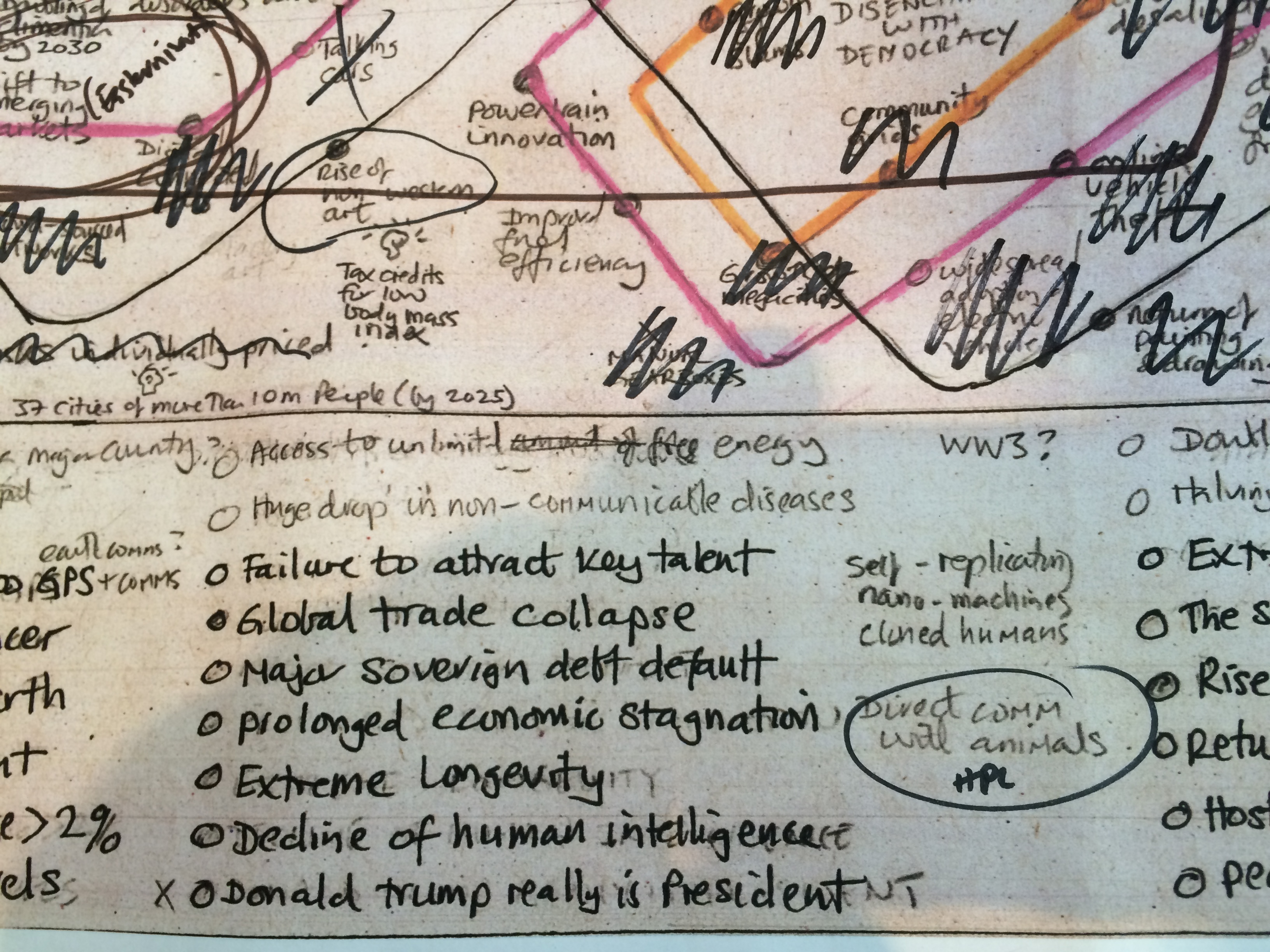
At the bottom of the map there are a series of global game changers. These are broadly mega risks (x-risks) and by their nature rather negative. It would be interesting to do the map again and have this section about hugely impactful positive events, but that’s really quite hard to think of that many (like trying to think of utopian rather than dystopian sci-fi). BTW, I had ‘Donald Trump really is President’ as a global risk in this section ages ago, but obviously had to take him off when this really happened! (See image).
So what’s the map for? It’s really just what’s in my head right now (May 2017). Hopefully it will spark some debate and make people think, especially about where we, as a world, might be heading. If you like the map you might enjoy a couple of other important sources, namely two of my books Future Files and especially Digital Vs. Human. Thank you for reading.
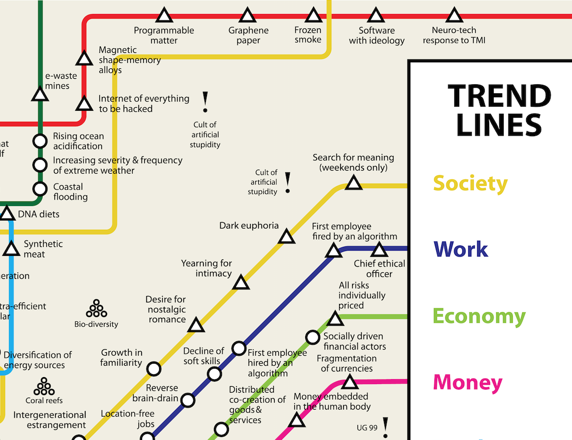
PS – There’s a lovely mistake on the map that I might just keep on. I added Cult of Artificial Stupidity as a place of interest – but I added it twice.
Finally (but probably not) here’s a link to some of the things that never made it onto the map or were taken off (i.e. trends and future predictions)
Counter-trends
 I had an interesting question from a workshop with EDF Energy a few days ago. I was talking about strong trends spawning counter-trends. Examples might include globalisation and localisation or fast food and slow food. So the question from EDF was has a counter-trend ever become stronger than the original trend?
It’s hard to think of anything, although localisation is building to the point where it could take over much as it did before in 1914 (some might argue). Anyone got any thoughts?


