The Covid-19 line is dreadful, but I actually think the suicide line is worse in some senses.
Category Archives: information design
The Future of Urban Air
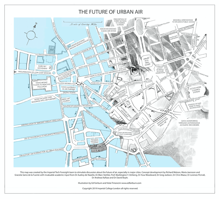
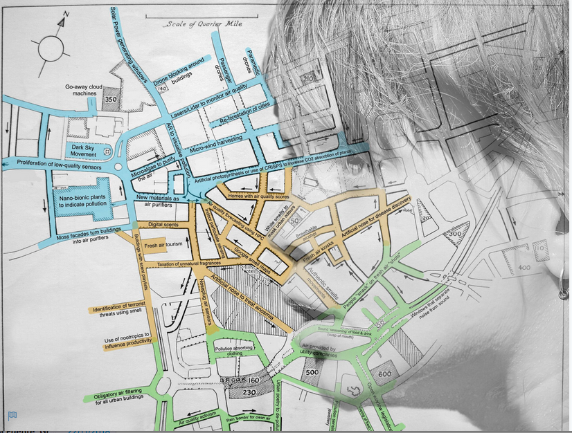
All good things come to those that wait. Here, finally, is the future of air info-graphic. Tomorrow (hopefully) I’ll post a link to the static map (PDF). Today, here is a rather spendid interactive version. (Click to enlarge and reveal hidden content).
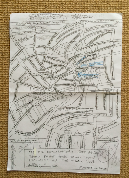
Sometimes these maps are quite quick to create (e.g. the Future of Space) other times they take forever. This started out as a scribble almost 2-years ago. I then looked at weather maps, ancient cartographic maps and stylised images of sails, even breathing and wind, but eventually the scribble morphed into a street map. At this point I stumbled upon the work of an illustrator called Ed Fairburn and the scene was set for what I hope will become a great example of art/science collaboration.
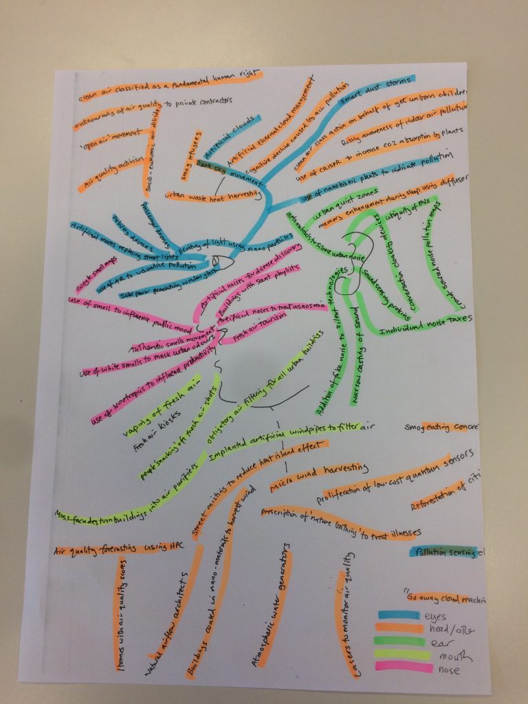
The visual is a fictitious city street map with the face of a child hand-drawn by Ed over the streets. (the child was a quite deliberate choice, because children are linked to the future and, more importantly, it is far more provocative than if we’d used the image of an adult). Visually based tends, inventions and ideas then cluster around the eyes, sound-based thoughts cluster around the ears, smells around the nose and so on. But before I go on to explain what’s on the map, why does it exist at all?
I did a map looking at the future of water with Imperial some time ago. I’ve done food in the past too, so air felt like an obvious theme. Various people at Imperial were looking into air (as was Davos) and a quick Google search found there to be next to nothing about the future of air or the future of air in cities, which is always a good sign. Why urban air? Because most of the big problems and opportunities surrounding air in the future will be found in cities and mega-cities in particular. Of course, conveying ideas about something that cannot be seen (air) is challenging, but hopefully the map itself will help and there are a couple of entries of the map itself that might solve this too.
Maps generally are a powerful way to convey information, messages, arguments or ideas and hopefully this one will provoke some conversation about what is, after all, the most precious and perhaps most threatened resource of them all.
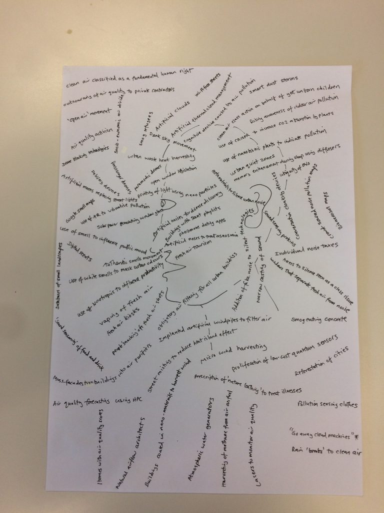
So, what’s on the map? Here’s a list. It’s not the final one, but it’s close and it does show some of the thinking that went into the map (things that got removed, debated etc.). BTW, ‘head’ is a cluster that comprises some cerebral thoughts, along with things that frankly didn’t fit anywhere else.
Credits for the map belong to yours truly, Richard Watson, Maria Jeansson and Graciela Sainz de la Fuente with academic input provided by Dr Audrey de Nazelle.
Head
Clean air as a fundamental human right
Smog refugees
Natural
airflow architects
Air quality activism
Artificial
thermal cloud management
Urban Wi-Fi free zones
Google smell maps
Memory enhancement during sleep via diffusers
Use of smell to influence public mood
Street misting to reduce temperatures
Databases of
smell landscapes
Rising awareness of indoor air quality
Pollution as a business opportunity
‘Prescription’ of nature to address illnesses
Artificial noses to treat anosmia
Cognitive decline caused by air pollution
‘Open air’ movement
Atmospheric water generators
Socio-economic clean air divide
Clean-air lawsuit on behalf of future generations
Identification of terrorist threats using smell
Pollution
harvesting ignites circular economy
CRISPR to increase CO2 adsorption by plants
Eyes
Solar power generating windows
Artificial moons to replace street lights
Drone blocking around buildings
Artificial clouds
Printing of
light using nanoparticles
Augmented reality to visualise pollution
Lasers to monitor air quality
Passenger & delivery drones
Nano-bionic plants to indicate pollution
Smart dust
storms
Go away cloud machines*
Paramedic drones
Micro-wind harvesting
Proliferation of low-cost quantum sensors
Dark sky movement
Moss facades turn buildings into air purifiers
Indoor particulate sensing
Nose
Fresh air kiosks
Personal nose-plug air filters
Authentic smells movement
Taxation of unnatural smells
Digital scents
Breathable alcohol
Homes with air quality scores
White smells to mask odours
Air quality forecasting using HPC
Use of nootropics to influence productivity
Artificial noses for disease discovery
Artificial nose to treat anosmia.
Fresh air tourism
Rain ‘bombs’ to clean air
Mouth
Windows that separate fresh air from noise
Open window legislation
Obligatory air-filtering for all buildings
Vaping of fresh air
People ‘snacking’ on fresh air shots
Pollution absorbing clothes
Outsourcing of air quality
to private contractors
Air provided by utility companies
Sound ‘seasoning’ of food & drink (cusp of mouth)
Pollution protected pushchairs
Ears
Silence as a class issue
Silent fireworks
Use of metamaterials to reduce noise
Narrowcasting of sound
CRISPR for auditory augmentation
Addition of fake noises to silent technologies
Crowd sourced noise pollution maps
Sound sensing proteins
Quiet road surfaces
Conversation cloaking devices
Individual noise taxes
Silent cities movement
Ubiquity of EVs
Increase in noise due to voice interfaces
Sensorial interventions to influence public behaviour
Use of sound
to influence public behaviour
The link to the interactive map once again. (click to enlarge and reveal hidden content).
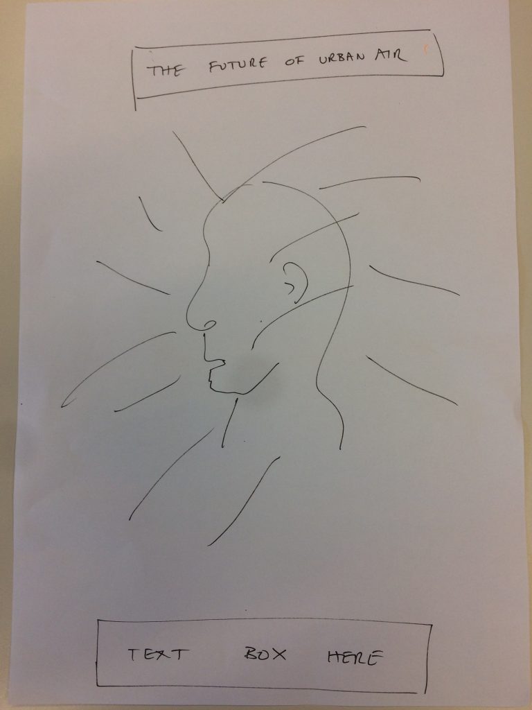
Finally, some of the early scribbles….

The Future of Air
OK people, it’s almost ready. Best one yet in my view. Watch this space.
New Map
A new ‘map’ is coming, hopefully next week. In my humble opinion the best one yet, certainly from an art/science collaboration perspective.

What might we eventually see in space?
Here’s a visual showing some of the things that might theoretically be possible in the distant future. Note that all the ideas listed here are possible from a laws of physics point of view, although the engineering challenges and costs associated with most of them are, shall we say, a bit ‘far out’.
The way this works is that the ideas that are closest (larger type) are nearer than the things far away (in smaller type). There’s some vague clustering of ideas too (for example, human habitation, propulsion, water and so on).
The ideas are as follows:
First woman on the moon
First human never to breathe Earth’s air
Mass emigration of climate refugees into space
More humans in space than on Earth
Use of lunar lava tubes for human habitation
Space cities with pseudo-gravity & circadian rhythm simulation
Discovery of AI-controlled data-farms on distant planet
Discovery of AI ‘lifeform’ in space
Verification of panspermia hypothesis
Proof that the Universe is a simulation
Genetic engineering of space colonists for increased resilience
Terra-forming exoplanets with bacteria
Use of Synthetic biology to detoxify space soil for agriculture
Space seeds specially bred for space soils
Human DNA storage vaults in space
Microbes found in meteorites
Liquid water found on distant planet
Asteroid mining for minerals & water
Refuelling of fusion-powered craft with water from comets
3-D printing of space food
First hamburger grown in space
3D & 4-D printing of space cities in-situ
Self-reconfiguring modular robots for space-based construction
Peak space junk limits launch of satellites from Earth
Space junk removal using 2-D space dumpsters
Companies fined for space littering
1-gram laser sailing nano-craft
Interstellar pit stops & ‘shipyards’
Worm-hole travel to shorten space journeys
Nuclear blast propulsion
Beam-powered propulsion
Reactionless drive
Dark matter harvesting for propulsion purposes
Dark energy engines (warp-drive)
Dyson sphere around the Sun to harvest energy
Fostering collisions between dead stars to create energy
Propulsion systems allow for relocation of planets
Accidental destruction of an exoplanet
Rearrangement of constellations to send message to a future intelligence
Space mirrors to reduce global warming on Earth
Beaming space solar power to Earth using lasers
Fake moons (illumination satellites)
This chart was created to boldly go where no infographic has gone before by Professor Roberto Trotta and Richard Watson at Imperial College London. Thanks to Lawrence (Wond Design), Maria (Imperial Tech Foresight) and Sergiu (ex Imperial, aerospace engineering). If NASA eventually read this, the answer is yes! Printable PDF is coming…
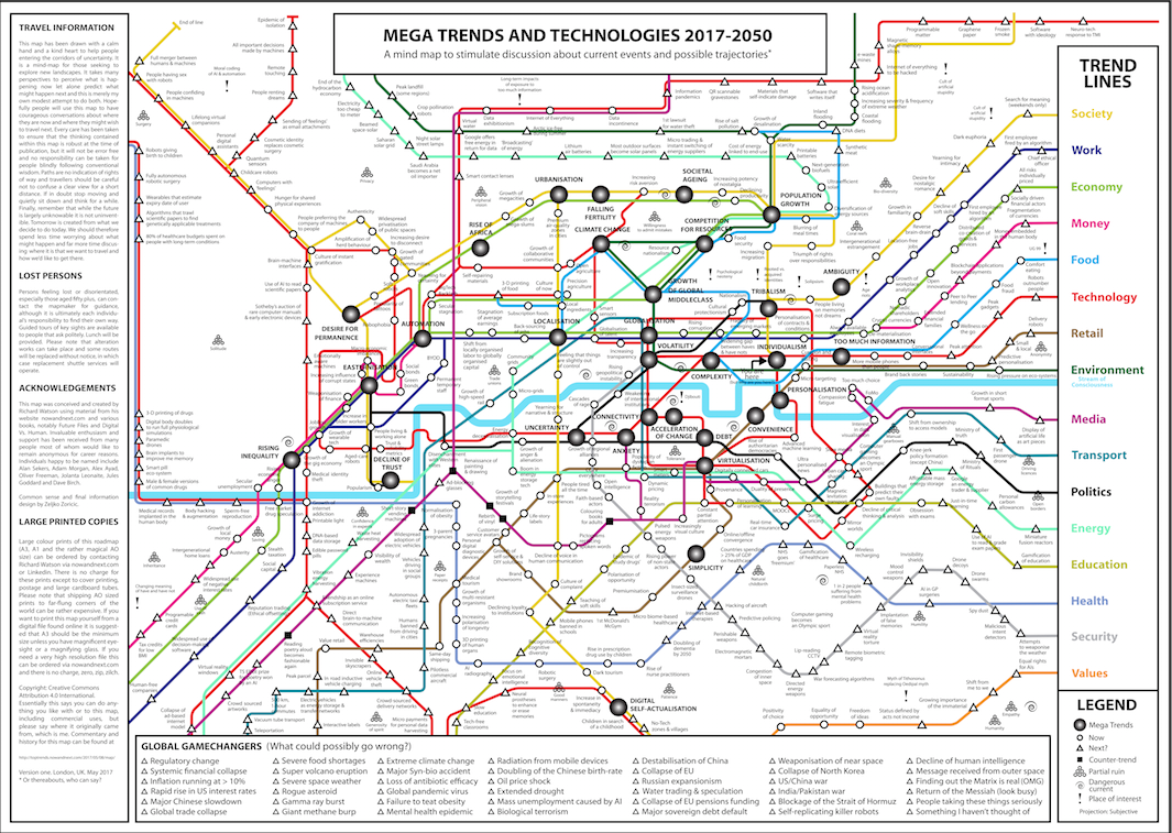
Map of Global Mega Trends
Here you go then. Use this link to get to a high resolution version. A3, A1 and rather wonderful AO sized copies on paper are available upon request (no charge except for print, post and a cardbaord tube). See you in the future.
Map
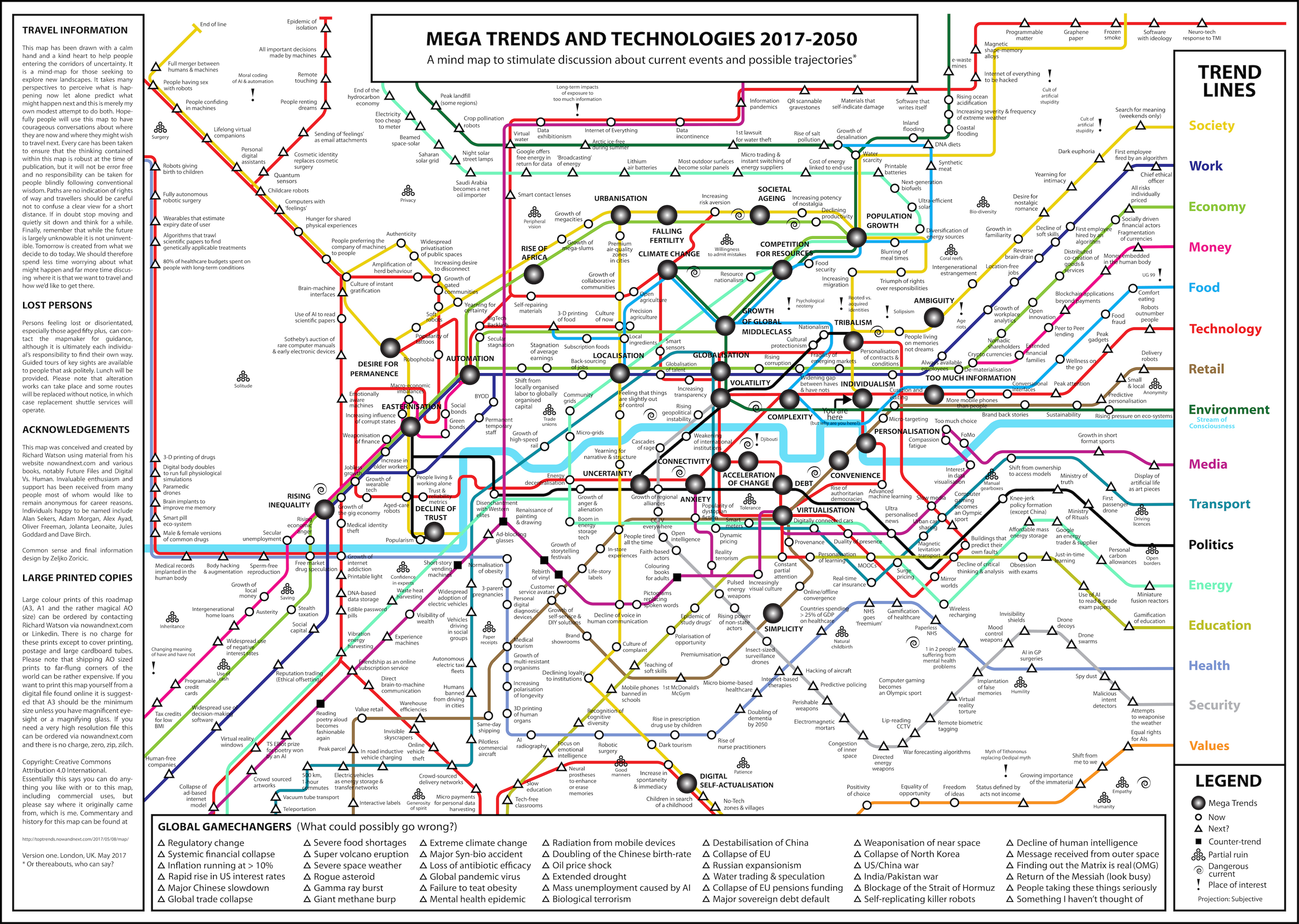
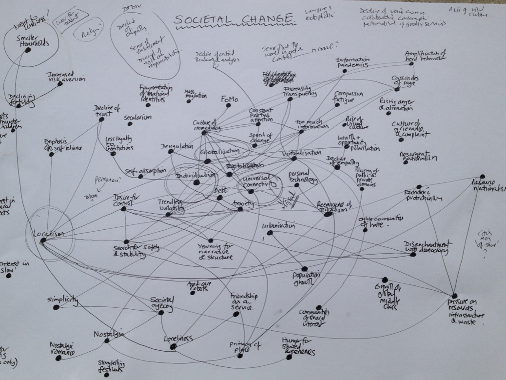
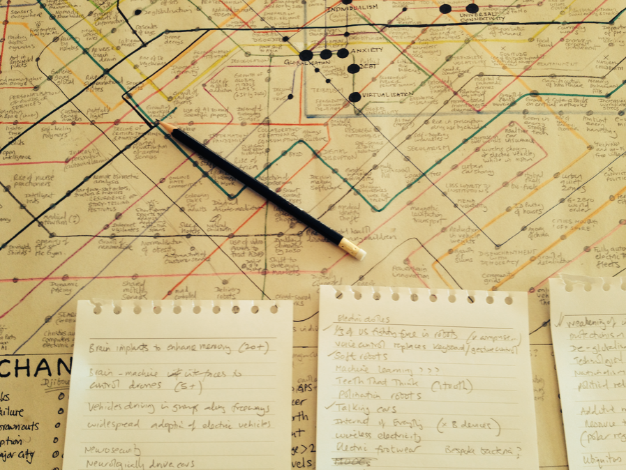
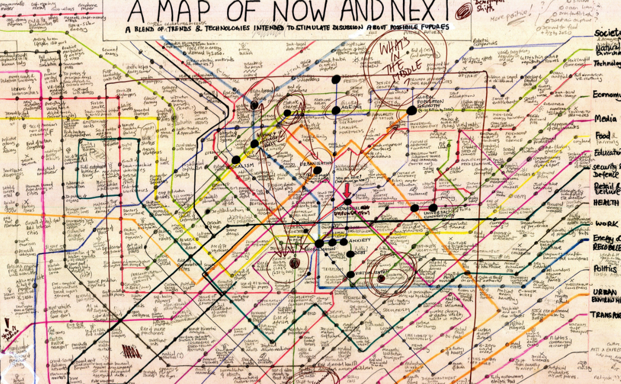
So here is a little background and commentary to my 2017 Mega Trends & Technologies map. This map began as an idea way back in 2015, but it wasn’t until early 2016 that I started to draw various outlines of what the map might look like.Eventually I settled on a look based on an earlier map I created in 2010. The initial thinking was very much about what the individual lines might represent and then obviously what to put on the lines and in particular the connection points (which took ages).
The mega trends were the first thing to get worked out. I had a gut feel about this already, but researched various publications to extend my thinking. These sources included work done by the MOD GST folks (Global Strategic Trends to 2040), the US National Intelligence Council (NIC) report on 2030, the OECD Science, Technology and Innovation Outlook 2016, Shell Scenarios and various reports by PWC, EY, KPMG and McKinsey. The main mega trends (about ten) broadly link with the mega trends contained within these reports, although I added a quite a few of my own to stir things up.
The final list of mega trends on the map (31 of them) are thus: population growth, urbanisation, rise of Africa, automation, globalisation, Easternisation, localisation (the same size as globalisation quite deliberately), climate change, falling fertility, societal ageing, competition for resources, growth of the global middle class, rising inequality, tribalism, ambiguity, individualism, volatility, complexity, personalisation, too much information, convenience, virtualisation, debt, connectivity, acceleration of change, uncertainty, desire for permanence, decline of trust, anxiety, simplicity, and digital self-actualisation.
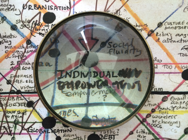
I had a big think about what should be in the middle of the map. In the end it was a connectivity, closely aligned with globalisation, acceleration of change, anxiety and volatility. Individualism was almost in the centre, but I had a long debate with myself about whether this was quite the right word. The NIC has Individual Empowerment as a mega trend, and this was tempting, as was Solipsism. In the end it was just plain individualism.
The lines radiating into or out of the centre (depending on how you read it) ended up being fairly familiar. They are society, work, economy, money, food, technology, retail, environment, media, transport, politics, energy, education, health, security and values. That last one was a last minute addition. Originally it was religion, then it became death (!) and then identity. I would have liked more time on this and may extend the line in any future versions.
The icons on the map are ‘mega trends’, ‘now’ (which means a current trend) and ‘next’ (meaning a future idea, innovation, event or trend). I also added ‘counter-trends’, ‘partial ruins’ (things that are dying out or in a state of decay), ‘dangerous currents’ and ‘places of interest’. Broadly ‘now’ (call it 2017-2020) is in the middle of the map and the future (‘next’) radiates outwards. All of the entries are serious and there’s a solid argument behind each and every one, but some are also intended to provoke, For example, the idea of wearables that display the predicted death date of the user is simply an extension of what’s going on now with a bit of gamification and exaggeration thrown in.
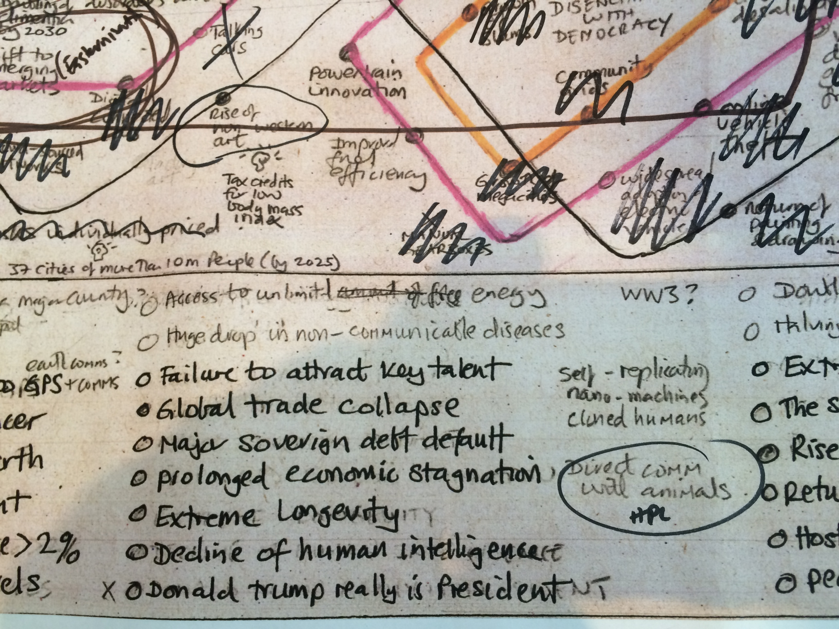
At the bottom of the map there are a series of global game changers. These are broadly mega risks (x-risks) and by their nature rather negative. It would be interesting to do the map again and have this section about hugely impactful positive events, but that’s really quite hard to think of that many (like trying to think of utopian rather than dystopian sci-fi). BTW, I had ‘Donald Trump really is President’ as a global risk in this section ages ago, but obviously had to take him off when this really happened! (See image).
So what’s the map for? It’s really just what’s in my head right now (May 2017). Hopefully it will spark some debate and make people think, especially about where we, as a world, might be heading. If you like the map you might enjoy a couple of other important sources, namely two of my books Future Files and especially Digital Vs. Human. Thank you for reading.
PS – There’s a lovely mistake on the map that I might just keep on. I added Cult of Artificial Stupidity as a place of interest – but I added it twice.
Finally (but probably not) here’s a link to some of the things that never made it onto the map or were taken off (i.e. trends and future predictions)

