How people spend money in America


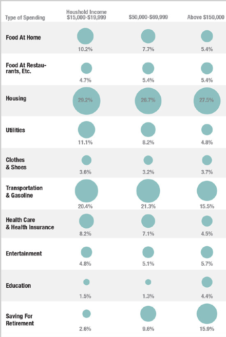
It’s been a while since we’ve had a bit of data visualization so here’s a nice info-graphic showing how the poor in America spend their money versus the middle class. Source is originally NPR/Planet Money, although I stumbled across it on Fast Co. The ‘saving for retirement’ is particularly interesting.

BTW, I’ve just started a new map to go with one of my new books. It’s a history timeline from 1960-2040 showing four alternative paths from 2012 – 2040. It’s going to be great.

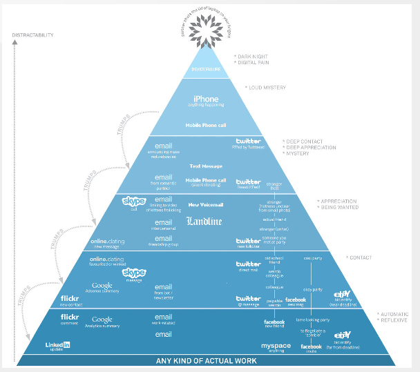
Map of Digital Distractions.

I really wish I had done this. It’s a map showing the hierarchy of digital distractions by David McCandless. At the very top of the pyramid is “Device failure” with “iPhone” underneath. At the bottom of the pyramid is “Any kind of actual work'” Brilliant.

You can see it at MoMa in New York.

Thanks to Lynda Koster for pointing this out to me.
More on the map here.

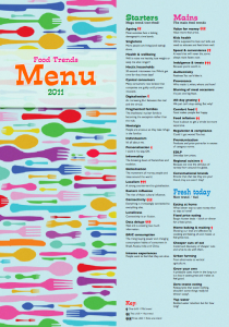
Almost served – Key food trends for 2011+

I’m just waiting on a hyperlink to put the new food trends menu out. In the meantime I’ve been trying to get my head around global trends for 2011 as a whole – as opposed to regional trends. I still have a slight Asia-Pacific lens, so the whole doom and gloom thing is not my default position. Basically, anything economic is up and in this region and down elsewhere (generally) but the economic obviously impacts the social.

Meanwhile, I came across a good quote from Woody Allen today that’s pretty good for anyone living in Europe, UK or the US.

“More than any time in history, mankind faces a crossroads. One path leads to despair and utter hopelessness, the other to total extinction. Let us pray we have the wisdom to choose correctly.”

BTW, the food trends menu is 2 pages and is ordered by Starters (non-food mega-trends), Mains (the main food trends), Fresh today (new trends/fads), To Follow (emerging trends), Sides (trends from left-field), Fixed menu (Key food trends), Drinks, Food retail and Food technology. If anyone wants a pdf copy of the menu send me an email (via nowandnext.com) or leave a comment on this post.

Facebook Finish

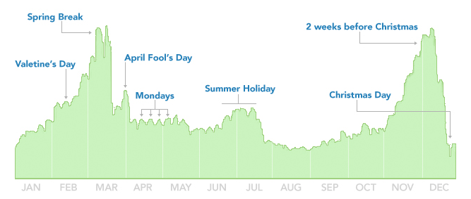
An interesting data visualization from David McCandless showing when people break up via Facebook status updates.

Out-takes. 1) Lots of people break up before Spring Break and the summer, 2). Lots of people start the week by dumping their other half, 3) Most people have the common decency not to dump their partners on Christmas day.

New map (not mine)

Hello again. First of all I think I should apologise to members of the Outdoor Swimming Society (last post). I’m sure they are all lovely people and even I would agree that going for a dip (even in freezing cold and somewhat suspect British water) is much better than playing on an X-Box.

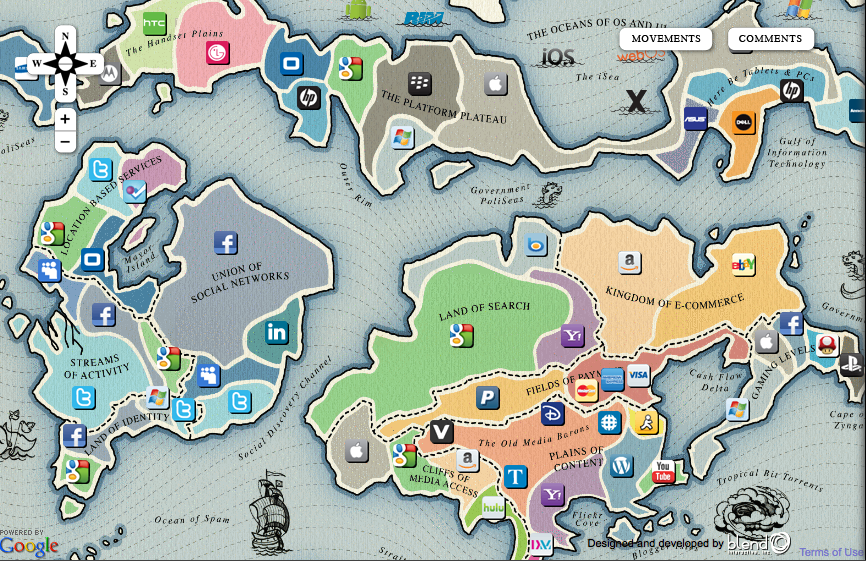
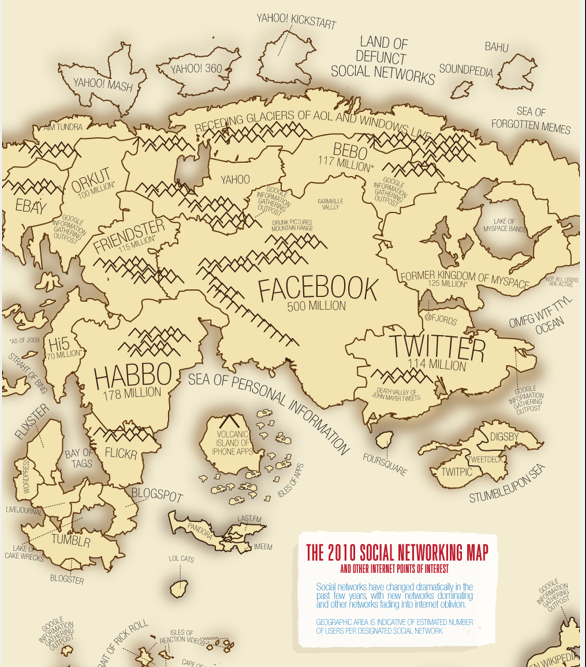
Anyway, here’s a new map from Tim O’Reilly via Ross Dawson. I can’t share my new map with you quite yet but it makes for an interesting counter-point.

More at http://map.web2summit.com/