Have you noticed the grey? Not just 50 Shades (the top selling book of the decade we’re told), but in car parks, on Pinterest, in Elle Decoration and on the catwalk. There is a theory (which we probably shouldn’t take very seriously) that major fashion trends only become obvious at the halfway point of each decade, so now might be a good time to make a call. Sales of grey t-shirts have risen hugely recently. So have sales of grey and silver cars.
So what’s the story? According to Oriole Cullen, a senior curator at the Victoria and Albert Museum in London, grey was historically associated with half-mourning. In other words, if a family member died you traditionally wore black, but if someone more removed died the colour of choice was grey. So are we in some kind of collective mourning? Are we mourning the loss of something back in the day? (a phrase, like grey, that seems to have popped up out of nowhere recently). No, that’s not it. In fashion terms grey sits well with other colours. It’s also an ideal colour to showcase expensive fabrics. But ignore all this.
My view is that the most likely explanation for the rise of grey and silver tones is rampant anxiety. Silver cocoons you, either as paint on the wall, on a computer, as clothing or as a car exterior colour. Crucially, silver subconsciously represents armour and is protection against rapid change and deep uncertainty. Grey, similarly, represents solidity in the form of stone and stands for stability. Or, of course, it could all just be the whims of the facile fashion industry.
“Why is Grey the New Black?”… well actually, most people reading this will know that this observation is several years behind the curve…and me thinks you are over analyzing the psychological factors that makes grey so popular…
Not all greys are created equal…so depending on the undertones of the grey…it is a great neutral foundation to pair with color and color accents. Grey can be warm or cool, sophisticated or relaxed and casual…in fact, grey is very versatile in creating what ever mood or character one wants to in a color and design scheme…but “new”…’fraid not…
Grey, Gray, Greige………..all of my clients want it. It pairs well with all other colors, even beige. I believe grey is highly desirable because it allows personal freedom of expression. It becomes a backdrop for whatever color you are at the moment. In a society where freedom of expression is highly prized, grey cannot clash, whether in clothing, interiors or vehicles. I love it!
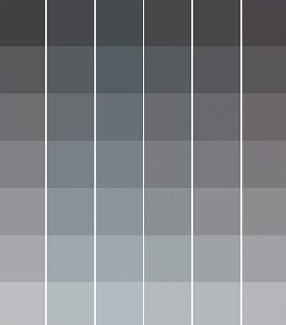
Gray – one of the most abused, and mis-used colors in all of the palette. Unfortunately the majority if clients (and designers) aren’t able to distinguish between warm and cool grays. The result? Uncomfortable interiors!
Grey is a wonderful background for all colors and in its contemporary use is often the neutral color for the youthful minded and has international appeal for graphic work. Notice how the French artists (& other artists) have used greys as a backdrop for all colors, especially with the complements of grey-blue & orange. To me, nothing could be more striking than an autumn scene, displaying colored fall leaves against the background of a dark cloudy sky at 9 or 5 pm, as the sun light shines through the the leaves from the opposite direction.
Grey is a wonderful background for all colors and in its contemporary use is often the neutral color for the youthful minded and has international appeal for graphic work.
Notice how the French artists (& other artists) have used greys as a backdrop for all colors, especially with the complements of grey-blue & orange. To me, nothing could be more striking than an autumn scene, displaying colored fall leaves against the background of a dark cloudy sky at 9 or 5 pm, as the sun light shines through the the leaves from the opposite direction.
I’ve been using grays for about 4 years now as my base neutral with more traditional neutrals. Maybe I started something.
All color is cyclical- we are all taupe d and beige d out so back comes gray!
A Word From The East: in Asia and the Middle East our hotel clients love the look of dove greys which we are using as a base palette even on wood floors, it has the attribute of being light and warm in the same moment. It lends itself as a foundation that accepts layering in monochrome or accented colorways. In china steel greys are too close to the polluted views outside the windows, whereas the dove greys or beige greys do not share that gloomy reference . We see it as a color trend with staying power.
What is it about this post that gets such colorful responses? 😉
R.
More! What is it with this? Or is it just that people that are interested in color are all online!!!
Actually, eons ago when I studied the psychology of color w/ the Wagner Color Institute, grey is considered the color for a “fence sitter”…one who cannot make a choice. This makes perfect sense here, as often a client who may wish to change colors within their interior, may not wish to make major changes, and so gray as a neutral allows that, and can be more moody or simply give that nice contrast between moldings and walls… also, it is considered to be a very good color for the walls of a room where someone is working on creative endeavors, as it doesn’t give ~ it allows one to let their creativity flow. Ah, and then there are those of us who find it depressing unless mixed with more jovial color. Any way we mix it, it’s interesting for we interior designers to see what we can come up with – and how we describe the whys and wherefores.