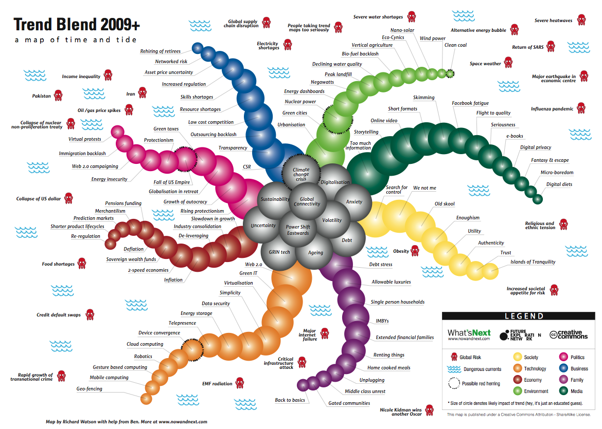
Here, at last, is my 2009 trend blend map. Here’s how it works. The main body of the map contains the mega-trends. These are, in no particular order:
Global connectivity
Anxiety
Volatility
Uncertainty
Debt
Power shift Eastwards
Ageing
GRIN technologies
Digitalisation
Climate change
Sustainability
There are then eight arms, which represent the following sectors or areas:
Society
Technology
Economy
Environment
Politics
Business
Family
Media
The circles (or disc-like suckers in giant octopus speak) on each arm are the sector trends and the size of he circle is related to the likely impact of the trend over the next twelve months or so. Finally, there is a selection of global risks, some of which are deadly serious and some of which are not. Then again, everything is subjective. Some people might regard EMF radiation as a more serious global risk than Nicole Kidman winning another Oscar but I’m not so sure. Enjoy! ☺
PS – The map will appear at nowandnext.com under ‘trend maps’ shortly and will also have a hyperlink attached to it within 24-hrs.
Heard Richard Watson at the Communities in Control conference in Melbourne and haven’t been the same since! Thanks very much.
It must have been the colours and shapes – makes people go all weird!
(I’ve always been weird).
R
X
Pingback: Thirty more sustainability diagrams « Computing for Sustainability
Pingback: Visualising sustainability « Computing for Sustainability