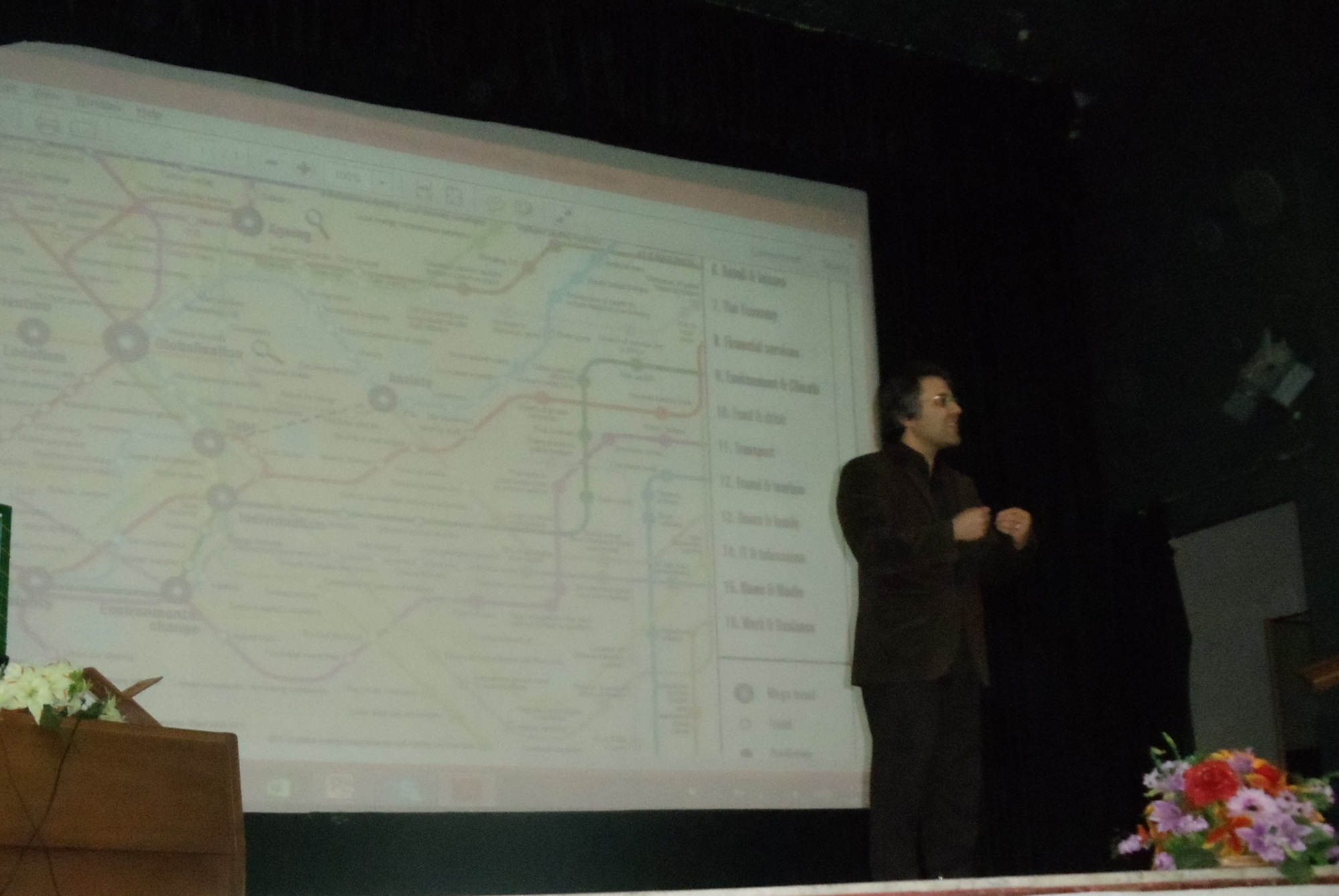
Seems my trends & technology timeline from 2010 has made it to Iran (above).
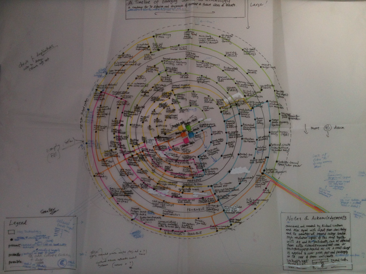
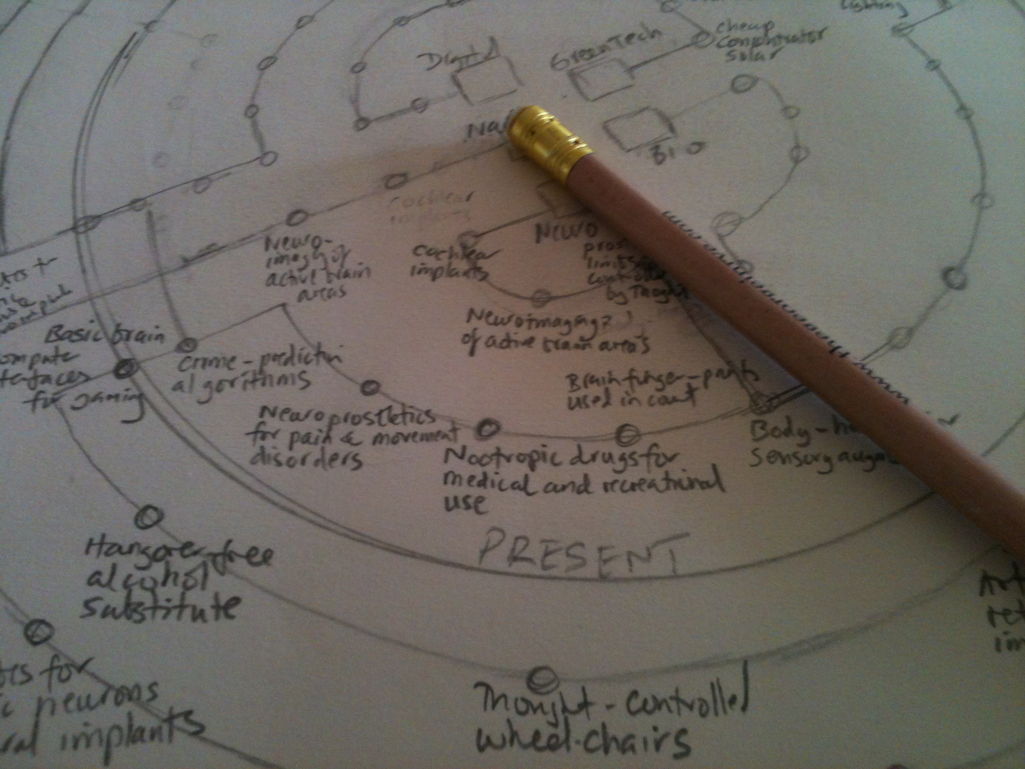
BTW, my new emerging technologies timeline that I’m doing with Imperial College is done (below) and now just needs some design polish. It has been thought about very carefully indeed, especially by about a dozen PhDs, and should be huge. Far better than anything similar I’ve ever seen. Hopefully available as a free high resolution download in a week or two and good old fashioned A1 and A3 paper wall charts a bit after that.


Richard – I see that you are a very dedicated blogger.
I came across your tube train maps via google images some time ago and see that they are taking on a life of their own.
One of my pre-occupations is working out ways of charting trends visually in order to figure out where things are heading. I created a completely subjective and totally unscientific “Global Morale Graph” in 2011 and made a guess at how things would pan out to 2015. You can see it here:
http://comingculturalrevolution.blogspot.co.nz/2011/01/global-emotional-index-2000-2010.html
It’s probably completely irrelevant from what you are doing, but I thought I’d share it anyway.
I’ve noticed that the majority of people tracking technological trends do not focus much on resource scarcity as a counter trend to ever increasing knowledge. I haven’t read enough of your stuff to know where you position yourself on the Techno-rapture vs Environmental Doomer spectrum. I am probably more pessimistic than most.
Anyway keep posting – always good to see how other minds conjure with things that are difficult to perceive but may be easier to feel.