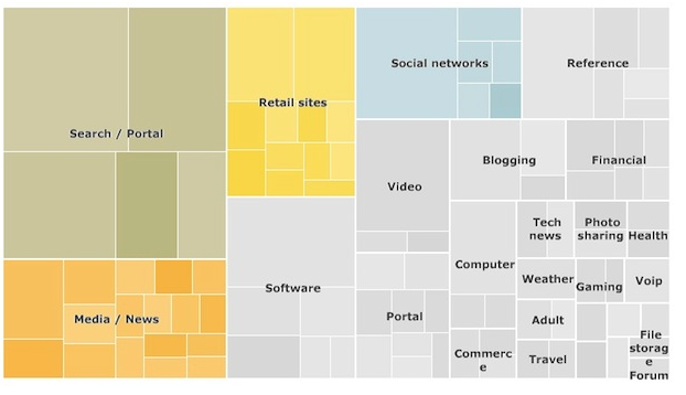
As you might know, I’m a huge fan of data visualisation so here’s something I really like. A map from the BBC showing where people go on the internet.
Link: http://www.fastcompany.com/1583565/infographic-of-the-day-comparing-the-100-largest-sites-on-the-internet
