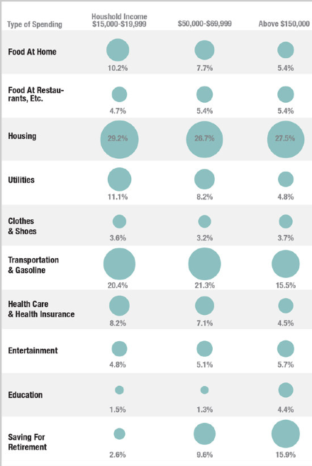
It’s been a while since we’ve had a bit of data visualization so here’s a nice info-graphic showing how the poor in America spend their money versus the middle class. Source is originally NPR/Planet Money, although I stumbled across it on Fast Co. The ‘saving for retirement’ is particularly interesting.
BTW, I’ve just started a new map to go with one of my new books. It’s a history timeline from 1960-2040 showing four alternative paths from 2012 – 2040. It’s going to be great.


Richard – I thought you’d like this one too:
http://xkcd.com/1093/
You’re right – it’s great!