What am I up to? Today I’m doing a keynote on the future of work at a human resources national convention and then it’s back to work on some scenarios for the future of public libraries. In between I’m doing an update to my book, Future Files, and I’ve just started work on yet another map.
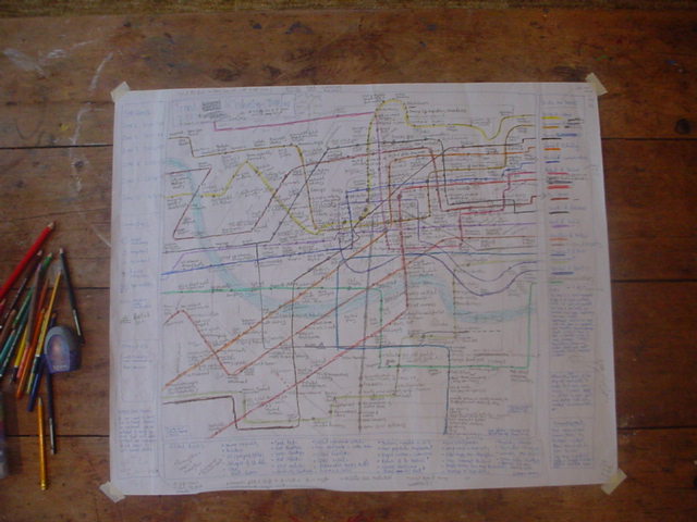
A few people have been asking how I do these maps so I thought I’d start to answer this question. The first stage is a brain dump. I write a list of every significant trend that I can think of. I then dump the trends into categories (lines) on a sheet of very large paper.
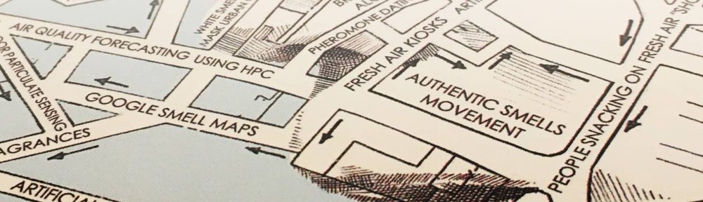
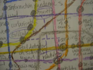
The image above is the result of this. The next stage is to look at this information for a month or two and work out what’s wrong with it. What have I missed? What shouldn’t be there? Most of all, how do these lines connect?
Any chance of a click through on the image to see the detail? Will help those of us who are a bit slower to understand how you’re doing it!
Thanks in advance!
Cheers
D
Sure, let me see what I can do…..
R.
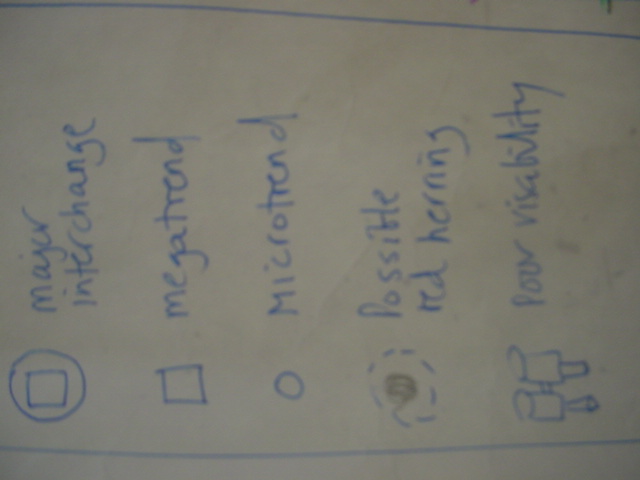
I can’t scan the whole sheet – it’s A5 size – and I don’t really want to either because it’s such early days. Basically there are currently 15 coloured lines representing retail, government, technology, health and so on and I’m adding anything that I can think of to the appropriate line. Then it’s a case of trying to make any connections clear (I haven’t really done this yet) and adding various icons (legends).
Once it firms up a little I’ll add some more shots and maybe post the text version of each line.
R.
Thanks Richard!
Look forward to it!
Best
D